Seaborn plotting approaches
Seaborn automatically groups data
The beauty of using the Seaborn package in scientificy data visualization, and especially for scientific publications, is that your data is automatically grouped together during plotting so you don’t have to manually calculate for example MEAN and STD for the data you want to plot.
Plotting grouped data only
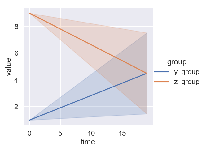
Let’s say that I want to plot a time-series of a variable per group (i.e. a condition) and plot the mean value and the standard deviation of each group:
sns.relplot(data=df, x='time', y='value',
    hue='group', kind='line', ci='sd'
    )
Returns
Here I am using relplot because it’s the best to start with if you are exploring the relationship between many variables. You don’t always have to use it if you just need to generate the plot above, but I often start with replot and the change to other functions if needed.
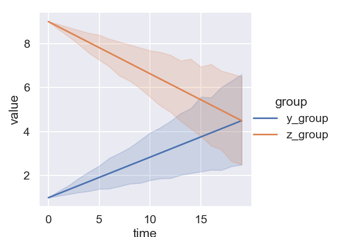
Let’s say that the journal you are submitting to doesn’t want STD for your plots but uses the confidence interval as the convention:
sns.relplot(data=df, x='time', y='value',
    hue='group', kind='line', ci=98
    )
Returns
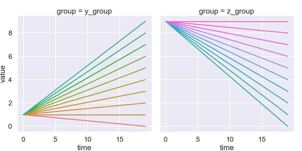
At times it’s preferable to show multiple grouping based on different variables. Often you have many data points that would make it hard to use line type / colors and or markers to differentiate those groups. Thus, I often rely on multiple panels:
sns.relplot(data=df, x='time', y='value',
    col='group', hue='label', kind='line', legend=False
    )
Returns
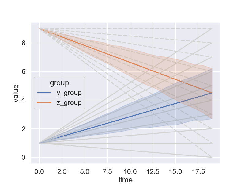
Plotting the individual and grouped traces together
It’s often useful to plot both the individual data and the group data on top of each other for scientific publications. So you not only show the trends and average behaviors, but you can also highlight the heterogeneity in your dataset.
I struggled with this hard before, as I was always very close to make what I wanted, but could never succeed to have it exactly like I wanted. This is the whole reason I am making this post.
- First, we need to create a common Axes object for both grouped and individual plots to be displayed on the same figure.
- Second, the parameter units allows us to display individual traces, but that requires us to set manually the parameter estimator to None.
- Third, I chose not to display the legend on one plot in order not to have too much information displayed.
- Fourth, plotting the two plots together causes some very frustrating interactions: in particular the shading areas of the grouped plot will display below all the traces by default, and we need to manually set the zorder parameter to a high number inside the err_kws setting of seaborn to have the error shades above the individual traces.
fig, ax = plt.subplots(figsize=(8,6))
sns.lineplot(data=df, x='time', y='value',
    estimator=None, units='label',
    style='group', color='lightgrey',
    ax=ax, legend=False)
sns.lineplot(data=df, x='time', y='value',
    hue='group', ax=ax, err_kws={'zorder':100.0})
Returns
Using seaborn.set to prettify the plots
I am very bad at manually set figures/ticks/markers size, labels font, line colors etc.. so I really appreciate if there is an automatic way to create aesthetically pleasant plots consistently with readable ticks and labels right away! And indeed seaborn provides this, it does still sometimes take some adjustments but overall the results are very satisfying.
The line below shows the style and context used in the plots in this post.
sns.set(style='darkgrid', context='talk')
For style you can choose amongst: “dark”, “white”, “whitegrid”, “darkgrid”, and “ticks” to choose how the overall figure looks. For context you can choose amongst: “notebook”, “paper”, “talk”, “poster” to choose how your labels, ticks and much more will look in the final figure. You can imagine how useful this can be depending on the reason you are making the figure for.
SOURCE
You can find the complete python script used for this post here.
Leave a comment