Useful seaborn plotting functions to explore your data
Exploratory analysis with Seaborn
I have been having fun exploring data lately so I wanted to write a summary post on the use of Seaborn to plot and examine your data.
I will be using the arctic penguin dataset as an example.
# Import required packages
import pandas as pd
from matplotlib import pyplot as plt
import seaborn as sns
df = sns.load_dataset('penguins').dropna()
First thing one should do is to familiarize oneself with the dataframe, i.e. variable names and types. Let’s take a look at what we have here.
# possible interesting categorical variables
for cat in ['species','island','sex']:
    print(cat, df[cat].unique())

print(df.head())
This returns
- species [‘Adelie’ ‘Chinstrap’ ‘Gentoo’]
- island [‘Torgersen’ ‘Biscoe’ ‘Dream’]
- sex [‘Male’ ‘Female’]
and a screeshot of the head of the dataframe.
In this dataset we have some interesting variables, in this case I explored the body_mass_g, the bill_length_mm and the flipper_length_mm numerical variable in relation with the above categorical variables
Data distribution and categories
I started with a boxplot to explore the behavior of the body_mass_g variable and to have an idea of which of the above mentioned categories could be interesting to explore.
# let's explore the data using seaborn
g = sns.catplot(data=df, x='island', y='body_mass_g',
            hue='sex',
            col='species',
            kind='box', sharey=True)
g.set_axis_labels('Island','Body Mass (grams)')
This code returns:
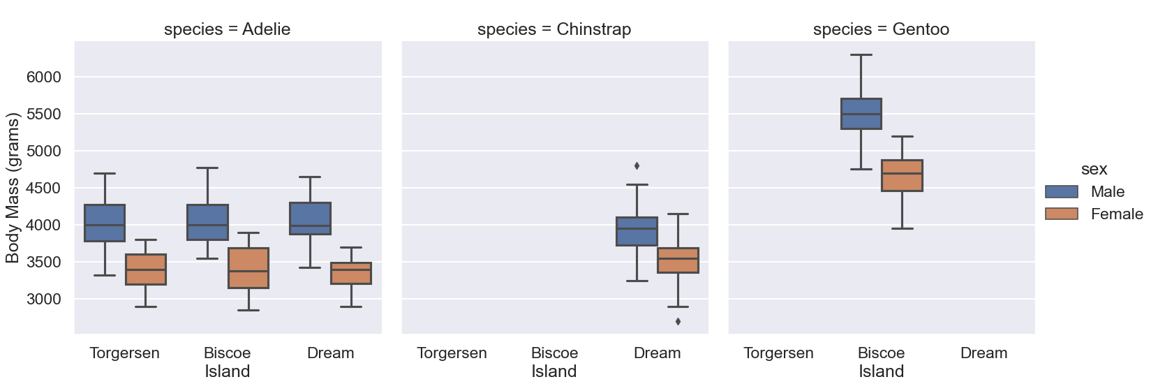
We can see from this plot that only the species Adelie has data for all 3 islands, so let’s focus on that species more. To illustrate more of the potential of seaborn I explored the data by looking at a violinplot with the individual data points overlayed on top.
sns.violinplot(data=adele, x='island', y='body_mass_g', hue='sex')
sns.swarmplot(data=adele, x='island', y='body_mass_g', hue='sex',
            dodge=True, palette=['lightgray', 'black']).set(xlabel='Island',ylabel='Body Mass (grams)')
This code generates the following plot:
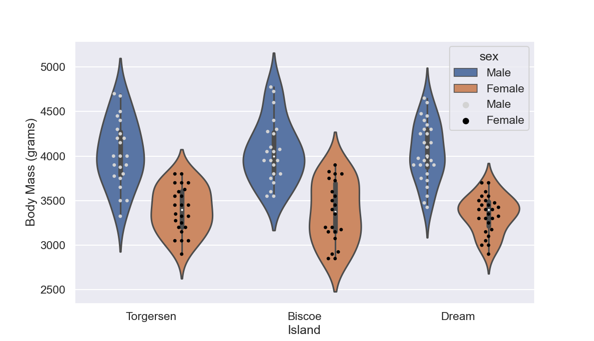
This is already quite interesting to notice and to me it’s also aesthetically pleasing.
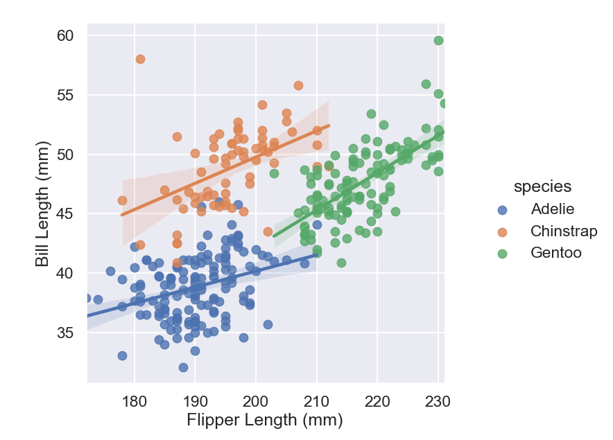
Bivariate relationship and regression
If we move to investigate the relationship between to numerical variables such as the bill and flipper length we also detect some interesting correlations. A priori, we could expect that bigger birds might have larger bills and longer flippers, is that the case?
g = sns.lmplot(data=df, x='flipper_length_mm', y='bill_length_mm', hue='species')
g.set(xlabel='Flipper Length (mm)',
    ylabel='Bill Length (mm)')
This code returns:
SOURCE
You can find the complete python script used for this post here
Leave a comment